All Dashboards Should be Feeds
Last week, we announced the new beta release of ThinkUp (if you’re a geek or developer, try it out!) and one of the reasons I was most excited to talk about the new release is because it has a whole new user experience which exemplifies a belief about analytics that I’ve become pretty adamant about.
Every time an app provides a dashboard full of charts and graphs, it should be replaced with a news feed offering a stream of insights instead.
There are lots and lots of apps that provide a dashboard of analytics these days. From Google Analytics to Chartbeat to Facebook’s Insights tool, there are all kinds of dashboard displays that we end up staring at while trying to manage a presence online. And they all share a consistent problem: It’s hard to tell what the hell is going on.

Beautiful but Empty
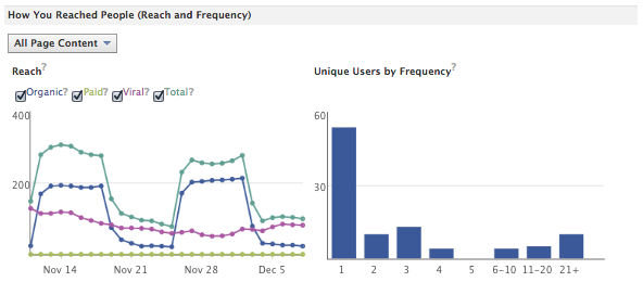
When I talk about “dashboards” here, I don’t mean ones that are already a news feed or stream of posts, like Tumblr, but the old-fashioned kind where you see a bunch of meters and dials and line charts that are supposed to communicate the current status of whatever you’re tracking. You can see Chartbeat’s beautiful set of graphs and charts above, and Facebook’s got a fancy one for insights on their platform; It looks like this:
And you know what? I have no idea whether my numbers on those services are good or not. I don’t know what I’m supposed to do about them. In fact, though I love Chartbeat, the information that I get from them that means the most is their push notifications on my phone which tell me when my site is over its maximum monthly number of visitors. That is meaningful.
Insights like exceeding my usual level of visitors, or achieving some threshold I’d never crossed before, or doing some task particularly efficiently would be meaningful markers that I could respond to intelligently.
Worse, trying to make sense of a gauge on a dashboard essentially requires me to keep three bits of data in my mind:
- What metric or measure a particular meter is reporting
- The last time I looked at that meter
- What the value of the meter was the last time I looked at it
That’s a lot! For more esoteric points, it’s downright impossible, so I’m left squinting at a little chart, trying to deduce its meaning. Or, on the other extreme, I get something like the line chart that shows my number of Twitter followers. That line only ever goes up and to the right. Sometimes it goes up more than others, but even that’s generally impossible to discern.
A Better Meter
We had precisely these issues with ThinkUp in version 1. Lots of little line graphs and pie charts that either rarely changed, or that changed regularly but with no explanation of the meaning of those changes or recommendations of what to do as a result.
And just getting to that stage was hard! The community put a ton of effort into collecting useful data, and presenting it appropriately. But all of that hard work still left an average user of the app squinting at some inscrutable charts, ultimately unsatisfied.
So we killed the whole dashboard. And replaced it with a simple stream. Here’s a live example of the White House’s social data, from a very early development version of ThinkUp 2.0. Now, not all of the data here are presented in a very compelling way yet, and of course we’re still working to shed our old implementation of basic charts and graphs to move into a stream that does much more to coach you about what you should be doing online.
Take the idea of your follower count. ThinkUp used to offer a pretty standard inscrutable little line chart showing your number of followers going up over time. But now, there’s a stream with a couple of items in it that look like this (these aren’t the final UI, just a work in progress):

That offers a bit more analysis, showing a forward-looking extrapolation of when the @whitehouse account will reach a certain number of followers. If someone sees that as a useful goal, they now have much more info than they would have had from a chart showing their past history of growth.
Then we can break down that data even further and tease out the meaning by determining which of these followers are notable for being popular or discerning enough that they should be called out or paid attention to. That looks like this:

And this isn’t to say that traditional charts or graphs don’t have a place in communicating information in this stream. But what we’ve done is put them behind disclosure buttons (again these are just a first prototype of the UI for such a thing) and made it possible to reveal the details behind an item, whether that’s a detailed chart or just a full list of people to pay attention to.

Similarly, you can see an expanded version of the “interesting new followers” insight in the ThinkUp demo for the White House as well.
Even with just a rough version of our new stream built out, I immediately realized that this was a fundamentally better way to quickly consume this analytics data and be able to make decisions or act on it. There were also many other benefits to radically simplifying the user interface — I only see data now when it changes in a significant way, so I don’t have to go digging around a bunch of different screens trying to deduce if something has changed and whether the change is meaningful.
This has really quickly ruined me for every other stats app that I use. Chartbeat is awesome for being real-time, but it’d be so much more compelling if it were a real-time stream or Twitter-style feed of information about how my site and my content’s doing, with the ability to drill down into individual insights about my site. Google Analytics has always been totally inscrutable to me, but if it just bubbled up particularly meaningful tidbits about my site or its stats I can imagine being able to actually make educated decisions about what I do here. As it stands, I haven’t had any reason to go into Google Analytics in ages.
So, a big but sincere request to everybody who’s making analytics or stats apps, either standalone or as part of a larger app: Please throw away the dashboard. I know they demo well and look great in investor pitch decks or screencast videos. But they don’t actually help me make decisions, or get better at what I’m doing. And that’s the only reason I’m measuring something in the first place.
Related Reading
If you liked this (or hated it), you should also read Stop Publishing Web Pages, about the move from static web pages to streams that are part of app-style experiences. It’s in the same vein.